Case study · Stash online store
The store
No countdown timers.
My own brand, and it refuses to hype itself, so the usual conversion tricks were off the table. Six pages from the live store; walk through them.
- Role
- Product design (UX + UI)
- Scope
- Six pages, self-initiated
Scene 01 · The walk
Six pages, one argument.
Step through the store in order, home to a 404. Each page scrolls inside the window; its decision is under it.

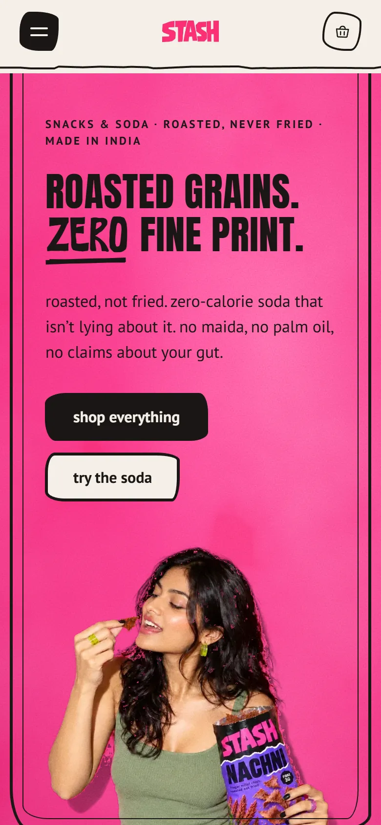
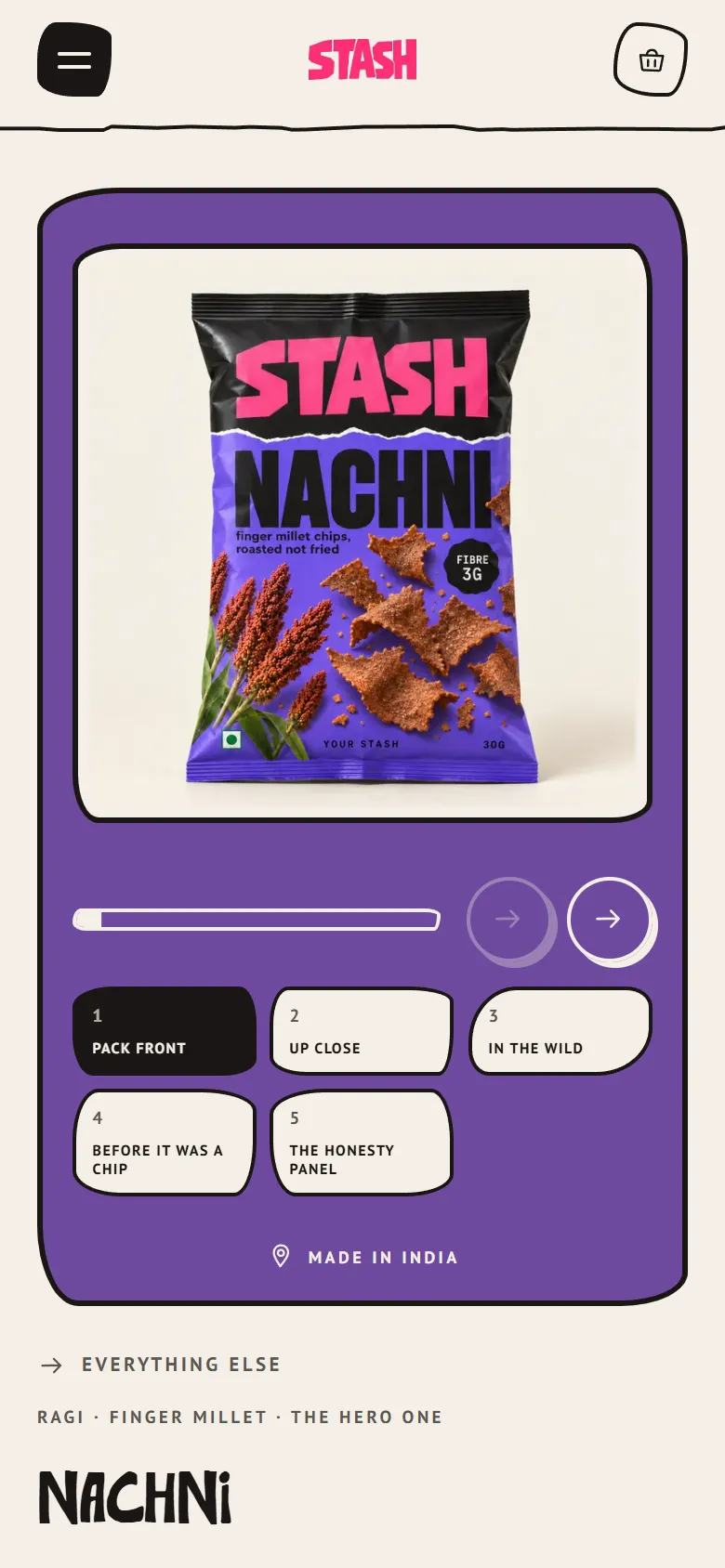
01 What's in it comes first, before any ask: the back of the bag sits right under the hero.
Scene 02 · What it proved
Specific beats urgent.
What does the selling
Naming the grain and printing what the snack isn't did the job a countdown usually does.
What I'd test first
The honesty panel is my read of anti-hype, not yet tested with real shoppers.