UX
The review
Every screen is a decision.
01 · 4 screens
The Rag Factory
Hired to write Amazon pages. Ended up redesigning their website.
Read the case study →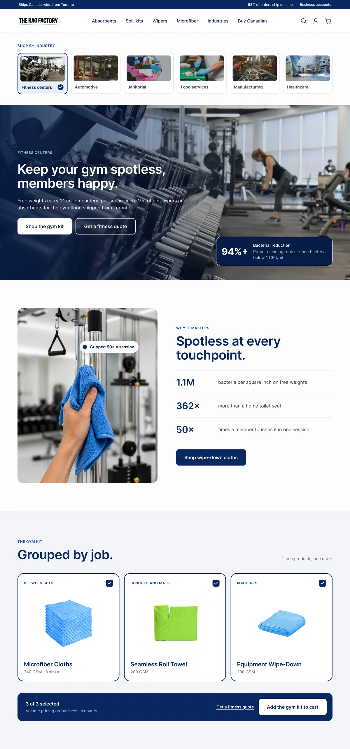
Industry-led navigation
Buyers default to vendors who speak their language, so industries became the top-level navigation, each one a picture of the buyer's own floor.
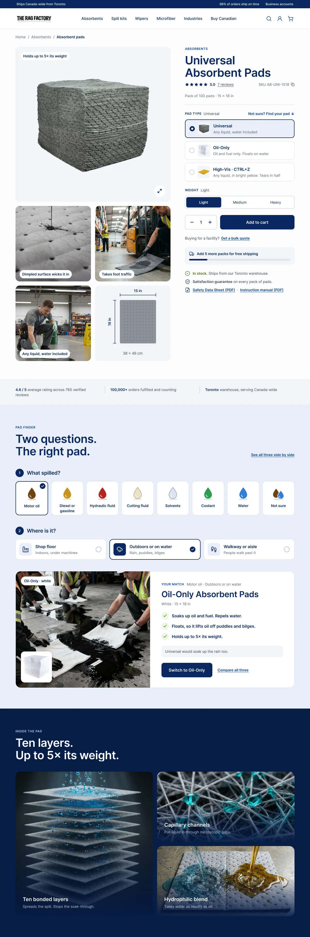
Pages that teach
Lead with the use case, not a spec dump. Every pad type says what it absorbs, right where you choose it.
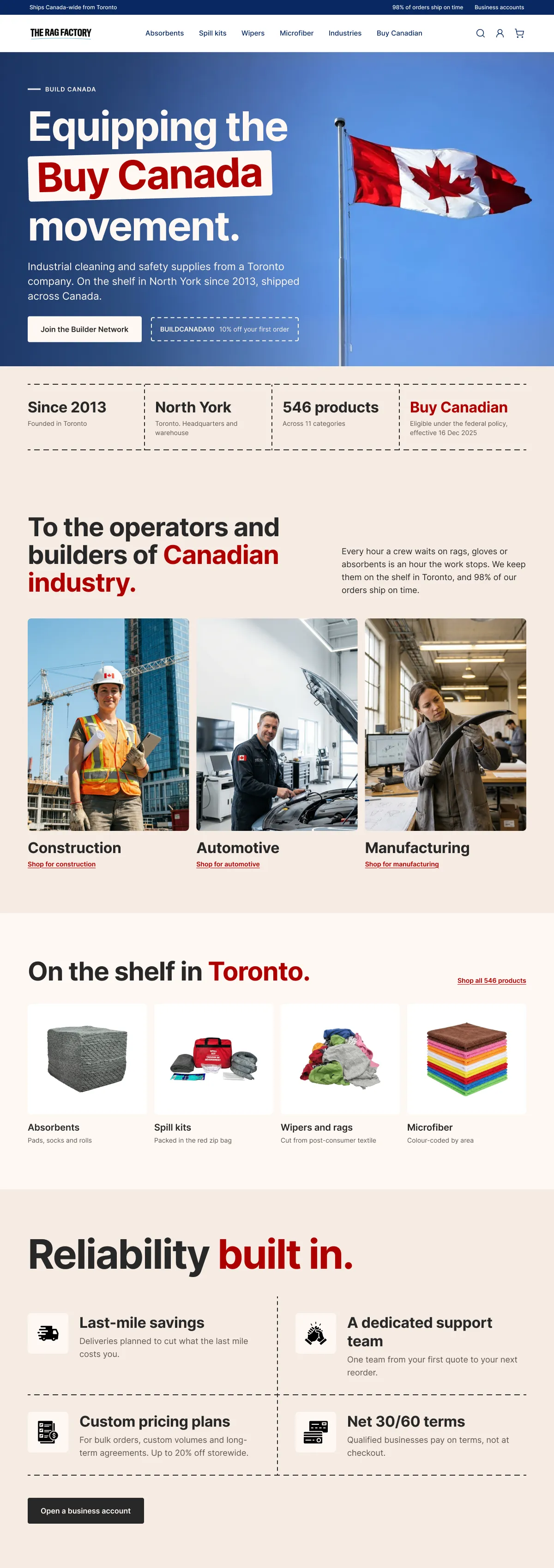
A Build Canada page
The procurement advantage was buried in a footer. It became a campaign page in its own colours, written to the people who buy.
A pad finder
A table of eight liquids against three pads, replaced by two questions: what spilled, and where. One pad comes back, with why.
02 · 4 screens
Stash
A snack brand's storefront, built on one argument: it doesn't need to shout.
Read the case study →
Home
What's in it comes first, before any ask: the back of the bag sits right under the hero.
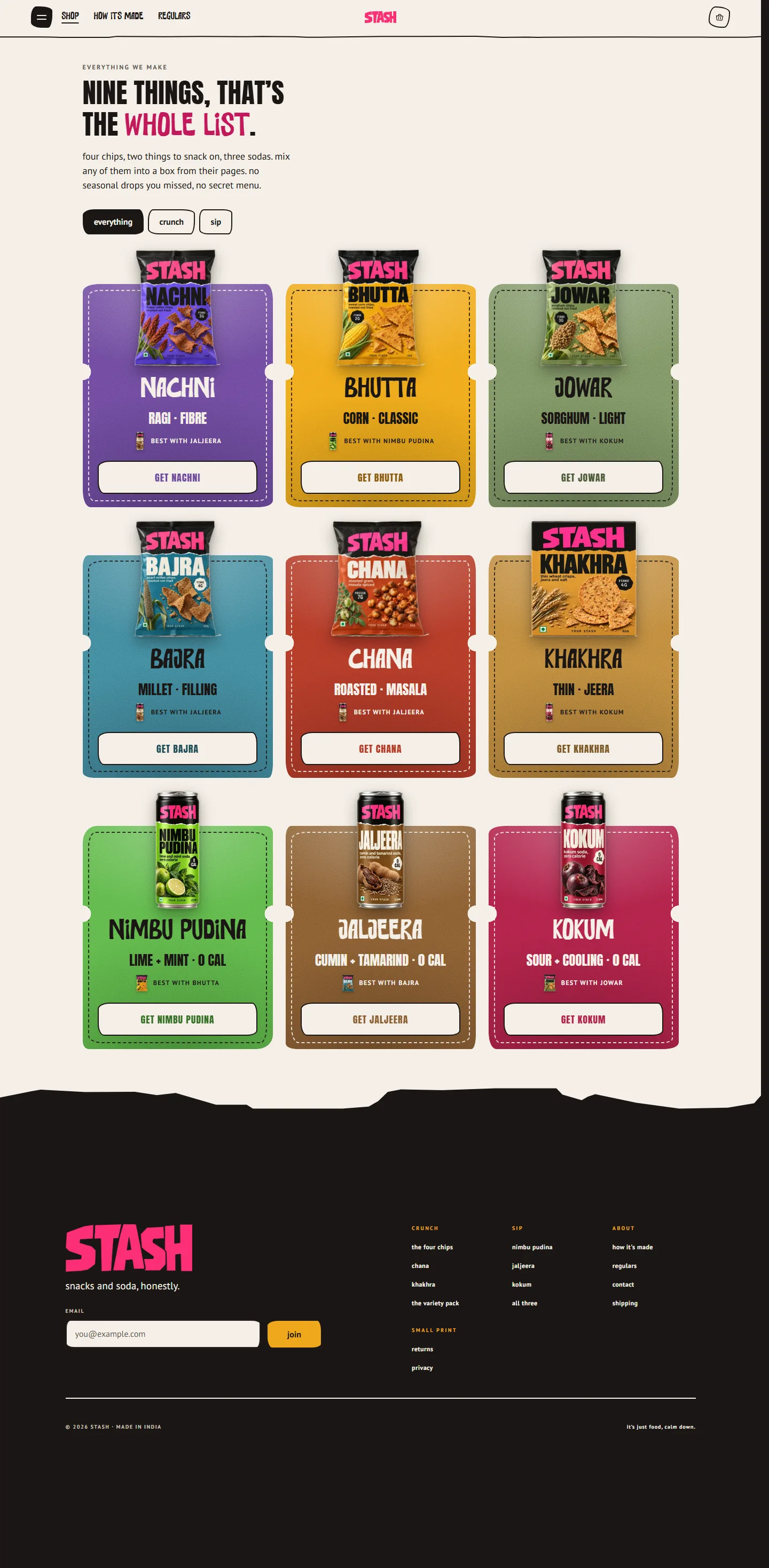
Shop
Nine things, one ticket each. No badges, no stars, no sort by popular.
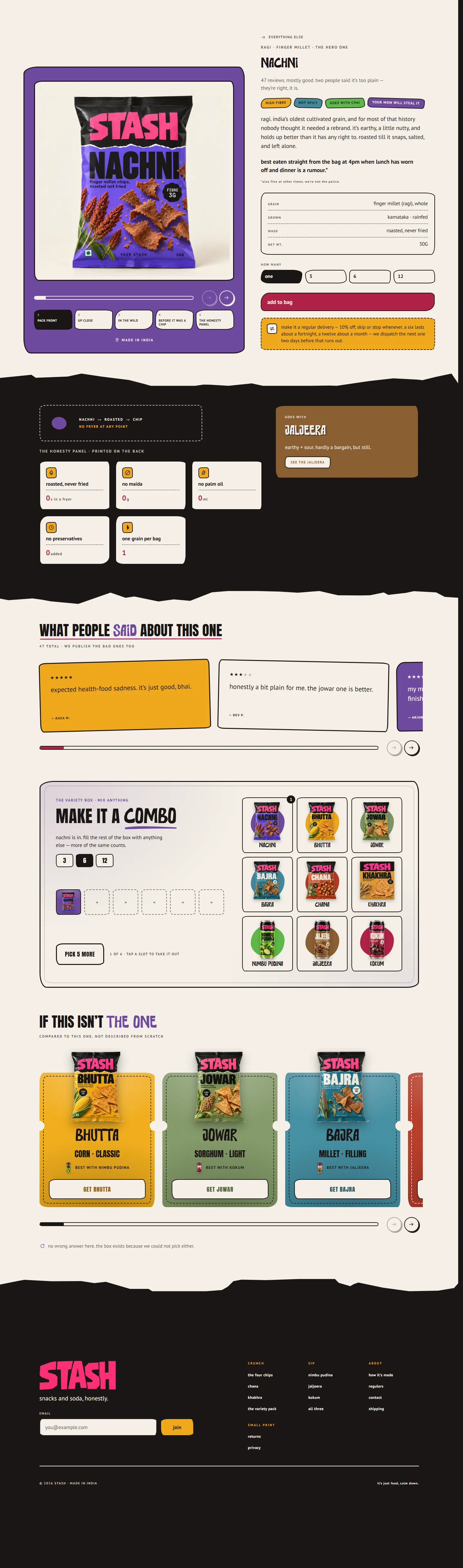
Product page
Every product page publishes a bad review, on purpose.
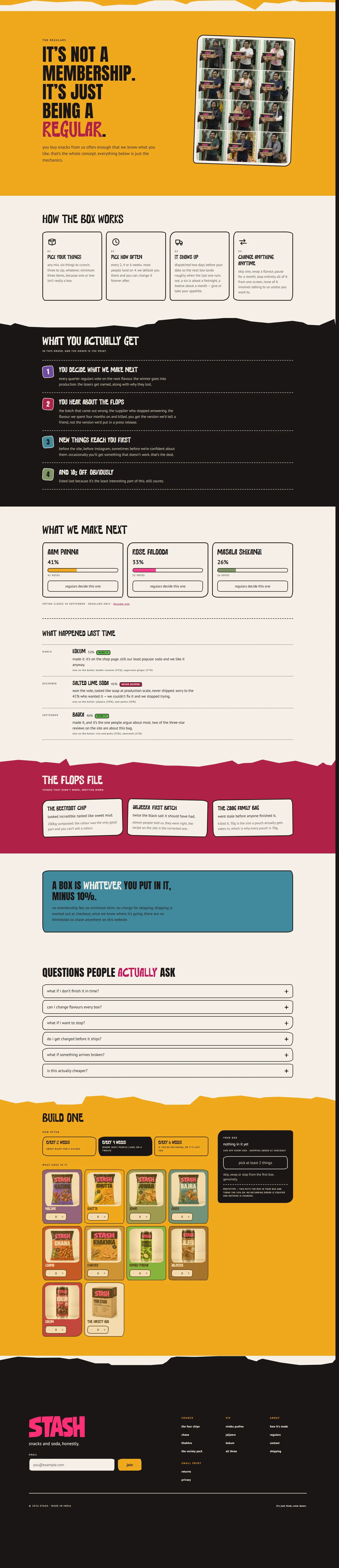
Regulars
For regulars, the vote on the next soda comes before the discount.